Total Cost of Care
Beginning in 2022, the Alliance began analyzing the total cost of care delivered across Washington state. Along with the Community Checkup, the Alliance has been able to offer an in-depth view into quality and cost of care in our state. Review the 2024 findings.
With an eye toward equity, the Alliance incorporated the Neighborhood Atlas, a tool validated by the University of Wisconsin, to show how where someone lives can impact the cost of care they receive in Washington. Read more on our Community Checkup website.
Highlights from 2024:
Understanding the cost of health care is an important metric to gauge the value a patient receives. This becomes even more important when we look at some of the socioeconomic barriers to care that impact access including an individual’s ability to afford appropriate, quality care.
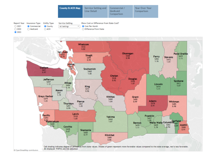
To better highlight the cost burdens of health care, the Alliance in 2024 is publishing the average cost by medical group and clinic, county and Accountable Communities of Health (ACH). The costs are broken into five major categories and 65 service lines.1 Examples:
- Hospital Inpatient—medical, surgery, maternity, skilled nursing facility (SNF) and Long-Term Acute Care Hospitals (LTACH).
- Hospital Outpatient—Day surgery, radiology, emergency medicine, and pharmacy infusions.
- Professional—Physician office visits, physical therapy, occupational therapy, radiology, preventive care, specialty drug treatments, and urgent care.
- Prescription Drug—medicines dispensed at retail pharmacies.
- Ancillary—ambulance, home health care, durable medical equipment, glasses and contacts, and prosthetics.
The high cost of health care is a burden on U.S. families, with 47% of families finding it difficult to afford their health care costs.2 Identifying costs and trends is a powerful management tool for purchasers and health plans to identify opportunities to contract differently, create centers of excellence, steer members to more affordable options, leverage reference-based pricing models, adjust plan designs, etc. Providers in value-based arrangements may identify different referral options at a lower cost for the same service or voluntarily lower their pricing to gain market share.
Through this understanding of how money is being spent, efforts can be made to strategically break longstanding cost trends. Failure to do so will result in delays in access to care, decrease the ability to close clinical gaps in care and ultimately result in higher cost care that could have been avoided.
About the Results
The Alliance reports on the average cost results for medical groups and clinics on a per patient per month basis (PPPM). Read more about how PPPM is calculated.
For the state, along with each county and ACH, the results are reported on a per member per month basis (PMPM). Read more about how PMPM is calculated.
Using risk adjustment, the Alliance set the state’s average risk score at 1.0, based on each patient’s use of health care services, including diagnoses and prescriptions.3 A medical group or clinic’s risk score under 1.0, indicates a relatively lower burden of illness for the patient population. In comparison, a risk score over 1.0 indicates a relatively higher burden of illness and can result in a higher cost of care. Risk adjustment accommodates the reality that poorer health usually requires more services and allows for more objective comparison across physician groups.
The cost of health care can vary widely as they receive little more than preventive care while others manage multiple or complex health conditions that can be expensive. The most expensive patients are small but account for approximately 13% of all health care costs. This report captures the full spectrum including those high-cost patients, but people who did not receive any health care services during the reporting period are not included.
About the Visualization
Using the top bar and buttons, you can select different views of the data. Click on the drop-down menus to limit your results and hover over the table to see more details. The color coding on the County & ACH represent the comparison to the state average PMPM while the Medical Group and Clinic compare to the state average PPPM. Red is higher and green is lower. The Service Line Details and Year Over Year Comparison are the only results that are not risk-adjusted.
- 1The Milliman Health Cost Guidelines-Grouper was used to categorize the services analyzed.
- 2Americans’ Challenges with Health Care Costs by the KFF.
- 3The Milliman Advanced Risk Adjuster
.
Become a member
Get access to the latest news, research, networking events and committees.